I think you did a great job on it ,you had it all covered .i am planning on doing or getting a web page done at some point and I think I will borrow a few things you wrote .Originally Posted by evolutionkennels


I think you did a great job on it ,you had it all covered .i am planning on doing or getting a web page done at some point and I think I will borrow a few things you wrote .
Bravo! Looks great

Let me know, I will trade my web skills for fur, paws, and noses.... yellow preferred
Thanks Jack
Looks Great, some very nice breedings.

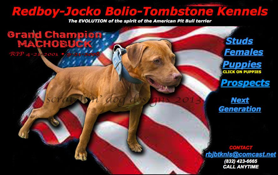
I think the new site looks very much like the old one. It's kind of busy looking with pictures and text everywhere. I think the first page should have an impact and the other pages have the smaller pics with the text arranged in a way that is pleasing to the eye. I think what you have written is great and I wouldn't change it, except for what the other members mentioned. This is how I would like to see your home page.
The best gamedog apparel on the net can be found here at:
http://scratchindog.com/
We might can work with that.
Now that's badass, Scratchin Dog. I see your design skills haven't left you
I agree. And, just to nitpick, the trend nowadays is smaller lettering, not ALL CAPS. Smaller letters looks more poised and professional, whereas ALL CAPS feels like you're being screamed at, ESPECIALLY IF YOU MAKE THEM BIG, which gets old after navigating through a few pages of it. Makes you feel like the person is having a fit
If you have to use ALL CAPS, or HUGE LETTERING, do it sparingly, but it's generally best not to use them at all IMO. Traditional italics (or even bolding) generally look better.
Jack
PS: As a final note, I had to chuckle about the "stupid questions" part. I used to post similar things on my site, almost begging idiots to just go away
Well I'll be damned, that is badass. Send me that logo and I'll put a link to your page right underneath it.
 Posting Permissions

 Reply With Quote